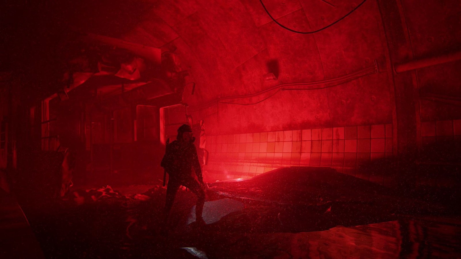
Color and atmosphere in games play a major role in how players emotionally experience a world, and DOOM The Dark Ages relies heavily on color to establish its tone. From the moment gameplay begins, the color palette communicates danger, weight, and hostility without the need for explanation. Instead of aiming for realism, DOOM The Dark Ages uses exaggerated contrast, dark lighting, and aggressive hues to maintain tension. Reds, burnt oranges, and deep shadows dominate the screen, ensuring that the atmosphere never feels neutral or safe.
How Color and Atmosphere in Games Affect Player Emotion
In DOOM The Dark Ages, color and atmosphere in games are used to control pacing and intensity. Muted environments slow the player down, while sudden bursts of color during combat increase urgency. These shifts happen visually before gameplay mechanics change.
Lighting reinforces this effect. Heavy shadows limit visibility, while sharp highlights guide player focus. This visual control ensures that the atmosphere stays consistent across encounters.
Why DOOM Relies on Color Over Dialogue
DOOM The Dark Ages uses minimal storytelling, which makes color even more important. The environments communicate mood through visual design alone. Color choices replace exposition by setting expectations immediately.
Because color and atmosphere in games remain consistent throughout the experience, immersion is never broken. The world feels cohesive and intentional rather than decorative.
Conclusion
DOOM The Dark Ages shows how effective color and atmosphere in games can be when used with restraint. Through controlled palettes and lighting, the game creates a mood that supports its tone without relying on narrative cues. Color becomes a tool for emotional direction, not just visual style.